890th played so far
Genre: Action
Platform: Various
Year of Release: 1988
Developer: Novotrade
Publisher: Epyx
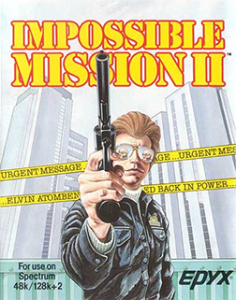
Impossible Mission II is, in fact, not related to the Mission Impossible franchise, despite using the same words in the title. It is, instead, the sequel to Impossible Mission, which is about a secret agent infiltrating an enemy base and, well, at least sounds like it’s a similar thing?
The first game had less enemy robots and, it seems, some other minor feature changes, but otherwise this is a sequel very much based on the original. It’s probably a good thing I don’t have to cover both.
Our Thoughts
Impossible Mission II feels quite complex considering the systems it was released on, the primitive graphics and how it looks like a standard one screen platformer looking better than, but deriving from something like Bounty Bob Strikes Back. In fact, Nebulus is close to it, having you climb towers while having little resembling the complicated interactions this game has.
In this game, you have a time limit to climb eight towers, solving puzzle rooms to get parts of a passcode to get into the ninth tower and beat the game. Each room – there are a handful per tower – has its own puzzle, involving some mild jumping, timing your moves around robots, and taking over these robots. You interact with varions PCs to get items and codes to continue and with that the bottom screen has a lot more going on, in part to record these different code fragments that are in-game audio files. As much as the game is described as an action game, it’s a puzzle on what to do.
Even beating a single room is difficult, even with help there was so much going on and I couldn’t make sense of what the various bits were. It’s the other side of the impressive coin, and the complexity in this way doesn’t transfer to modern sensibilities – the lack of mouse support, additional text to give some hints and the expectation that you memorize icons not fitting in well.
Final Thoughts
Impossible Mission II is a mix of different ideas, most quite good but in an interface that isn’t readable enough yet to pull it off. I’m not sure whether the modern remake fixed it, but it feels like a concept that other games could get a bit closer to and be even more interesting.
